炫酷霸气的HTML5/jQuery应用及源码
也许在5年前,HTML5还是一种很前卫的技术,大家还只是将它当做实验来看待,更别说产品应用了。但是现在HTML5已经非常流行,无论从PC端还是移动端,HTML5都扮演着非常重要的角色。今天我们要分享的一些应用就是基于HTML5和jQuery的,加上源代码的下载,你一定会觉得很受用的,赶紧分享吧。
HTML5线性图表 图表数据区域可着色
这是一款基于Canvas的HTML5图表应用,在图表数据初始化的时候伴随动画效果。
核心jQuery代码:
HTML5线性图表 图表数据区域可着色
这是一款基于Canvas的HTML5图表应用,在图表数据初始化的时候伴随动画效果。
核心jQuery代码:
- var myData = {
- labels : ["Mo","Di","Mi","Do","Fr","Sa","So"],
- datasets : [
- {
- fillColor : "rgba(220,220,220,.5)",
- strokeColor : "rgba(220,220,220,1)",
- pointColor : "rgba(220,220,220,1)",
- pointStrokeColor : "#fff",
- data : [65,59,90,81,56,55,40]
- },
- {
- fillColor : "rgba(90,190,90,.5)",
- strokeColor : "rgba(90,190,90,1)",
- pointColor : "rgba(90,190,90,1)",
- pointStrokeColor : "#fff",
- data : [40,48,40,40,90,27,90]
- }
- ]
- }
- new Chart(document.getElementById("canvas").getContext("2d")).Line(myData)

在线演示 源码下载
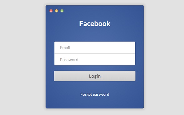
HTML5/CSS3仿Facebook登录表单
这是一款利用CSS3实现的创意表单,它的外观是模仿Facebook的。
核心CSS代码:
- .login-form-wrap {
- background: #5170ad;
- background: -moz-radial-gradient(center, ellipse cover, #5170ad 0%, #355493 100%);
- background: -webkit-gradient(radial, center center, 0px, center center, 100%, color-stop(0%, #5170ad), color-stop(100%, #355493));
- background: -webkit-radial-gradient(center, ellipse cover, #5170ad 0%, #355493 100%);
- background: -o-radial-gradient(center, ellipse cover, #5170ad 0%, #355493 100%);
- background: -ms-radial-gradient(center, ellipse cover, #5170ad 0%, #355493 100%);
- background: radial-gradient(ellipse at center, #5170ad 0%, #355493 100%);
- filter: progid:DXImageTransform.Microsoft.gradient(startColorstr='#5170ad', endColorstr='#355493',GradientType=1 );
- border: 1px solid #2d416d;
- box-shadow: 0 1px #5670a4 inset, 0 0 10px 5px rgba(0, 0, 0, 0.1);
- border-radius: 5px;
- position: relative;
- width: 360px;
- height: 380px;
- margin: 10px auto 20px auto;
- padding: 50px 30px 0 30px;
- text-align: center;
- }
- .login-form-wrap:before {
- background: url(http://i.imgur.com/0vLxyVB.png);
- display: block;
- content: '';
- width: 58px;
- height: 19px;
- top: 10px;
- left: 10px;
- position: absolute;
- }
- .login-form-wrap > h1 {
- margin: 0 0 50px 0;
- padding: 0;
- font-size: 26px;
- color: #fff;
- }
- .login-form-wrap > h5 {
- margin-top: 40px;
- }
- .login-form-wrap > h5 > a {
- font-size: 14px;
- color: #fff;
- text-decoration: none;
- font-weight: 400;
- }
- .login-form input[type="email"], .login-form input[type="password"] {
- width: 100%;
- border: 1px solid #314d89;
- outline: none;
- padding: 12px 20px;
- color: #afafaf;
- font-weight: 400;
- font-family: 'Lato', sans-serif;
- cursor: pointer;
- }
- .login-form input[type="email"] {
- border-bottom: none;
- border-radius: 4px 4px 0 0;
- padding-bottom: 13px;
- box-shadow: 0 -1px 0 #e0e0e0 inset, 0 1px 2px rgba(0, 0, 0, 0.23) inset;
- }
- .login-form input[type="password"] {
- border-top: none;
- border-radius: 0 0 4px 4px;
- box-shadow: 0 -1px 2px rgba(0, 0, 0, 0.23) inset, 0 1px 2px rgba(255, 255, 255, 0.1);
- }
- .login-form input[type="submit"] {
- font-family: 'Lato', sans-serif;
- font-weight: 400;
- background: #e0e0e0;
- background: -moz-linear-gradient(top, #e0e0e0 0%, #cecece 100%);
- background: -webkit-gradient(linear, left top, left bottom, color-stop(0%, #e0e0e0), color-stop(100%, #cecece));
- background: -webkit-linear-gradient(top, #e0e0e0 0%, #cecece 100%);
- background: -o-linear-gradient(top, #e0e0e0 0%, #cecece 100%);
- background: -ms-linear-gradient(top, #e0e0e0 0%, #cecece 100%);
- background: linear-gradient(to bottom, #e0e0e0 0%, #cecece 100%);
- filter: progid:DXImageTransform.Microsoft.gradient(startColorstr='#e0e0e0', endColorstr='#cecece',GradientType=0 );
- display: block;
- margin: 20px auto 0 auto;
- width: 100%;
- border: none;
- border-radius: 3px;
- padding: 8px;
- font-size: 17px;
- color: #636363;
- text-shadow: 0 1px 0 rgba(255, 255, 255, 0.45);
- font-weight: 700;
- box-shadow: 0 1px 3px 1px rgba(0, 0, 0, 0.17), 0 1px 0 rgba(255, 255, 255, 0.36) inset;
- }
- .login-form input[type="submit"]:hover {
- background: #DDD;
- }
- .login-form input[type="submit"]:active {
- padding-top: 9px;
- padding-bottom: 7px;
- background: #C9C9C9;
- }
在线演示 源码下载
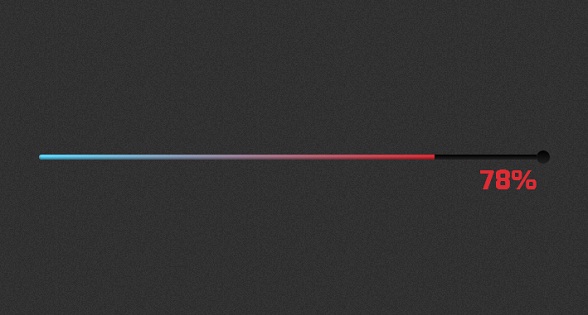
HTML5/CSS3超酷进度条 不同进度多种颜色
这是一款很酷的HTML5进度条插件,有不错的动画效果。
核心jQuery代码:
- var Loader = function () {
- var loader = document.querySelector('.loader-container'),
- meter = document.querySelector('.meter'),
- k, i = 1,
- counter = function () {
- if (i <= 100) {
- meter.innerHTML = i.toString();
- i++;
- } else {
- window.clearInterval(k);
- }
- };
- return {
- init: function (options) {
- options = options || {};
- var time = options.time ? options.time : 0,
- interval = time/100;
-
- loader.classList.add('run');
- k = window.setInterval(counter, interval);
- setTimeout(function () {
- loader.classList.add('done');
- }, time);
- },
- }
- }();
- Loader.init({
- // If you have changed the @time in LESS, update this number to the corresponding value. Measured in miliseconds.
- time: 10000
- });
在线演示 源码下载
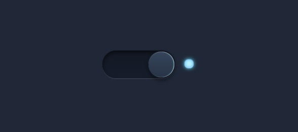
CSS3 3D发光切换按钮 模拟效果很逼真
这款CSS3 3D开关切换按钮效果还是很不错的。
核心CSS代码:
- .switch input {
- top: 0;
- right: 0;
- bottom: 0;
- left: 0;
- -ms-filter:"progid:DXImageTransform.Microsoft.Alpha(Opacity=0)";
- filter: alpha(opacity=0);
- -moz-opacity: 0;
- opacity: 0;
- z-index: 100;
- position: absolute;
- width: 100%;
- height: 100%;
- cursor: pointer;
- }
- .switch {
- width: 180px;
- height: 55px;
- position: relative;
- margin: 100px auto;
- }
- .switch label {
- display: block;
- width: 80%;
- height: 100%;
- position: relative;
- background: #1F2736; /*#121823*/
- background: linear-gradient(#121823, #161d2b);
- border-radius: 30px 30px 30px 30px;
- box-shadow:
- inset 0 3px 8px 1px rgba(0,0,0,0.5),
- inset 0 1px 0 rgba(0,0,0,0.5),
- 1px 0 rgba(255,255,255,0.2);
- -webkit-transition: all .5s ease;
- transition: all .5s ease;
- }
- .switch input ~ label i {
- display: block;
- height: 51px;
- width: 51px;
- position: absolute;
- left: 2px;
- top: 2px;
- z-index: 2;
- border-radius: inherit;
- background: #283446; /* Fallback */
- background: linear-gradient(#36455b, #283446);
- box-shadow:
- inset 0 1px 0 rgba(255,255,255,0.2),
- 0 8px rgba(0,0,0,0.3),
- 12px 12px rgba(0,0,0,0.4);
- -webkit-transition: all .5s ease;
- transition: all .5s ease;
- }
- .switch label + span {
- content: "";
- display: inline-block;
- position: absolute;
- right: 0px;
- top: 17px;
- width: 18px;
- height: 18px;
- border-radius: 10px;
- background: #283446;
- background: gradient-gradient(#36455b, #283446);
- box-shadow:
- inset 0 1px 0 rgba(0,0,0,0.2),
- 1px 0 rgba(255,255,255,0.1),
- 0 10px rgba(185,231,253,0),
- inset 0 0 8px rgba(0,0,0,0.9),
- inset 0 -2px 5px rgba(0,0,0,0.3),
- inset 0 -5px 5px rgba(0,0,0,0.5);
- -webkit-transition: all .5s ease;
- transition: all .5s ease;
- z-index: 2;
- }
- /* Toggle */
- .switch input:checked ~ label + span {
- content: "";
- display: inline-block;
- position: absolute;
- width: 18px;
- height: 18px;
- border-radius: 10px;
- -webkit-transition: all .5s ease;
- transition: all .5s ease;
- z-index: 2;
- background: #b9f3fe;
- background: gradient-gradient(#ffffff, #77a1b9);
- box-shadow:
- inset 0 1px 0 rgba(0,0,0,0.1),
- 1px 0 rgba(255,255,255,0.1),
- 0 10px rgba(100,231,253,1),
- inset 0 0 8px rgba( 61,157,247,0.8),
- inset 0 -2px 5px rgba(185,231,253,0.3),
- inset 0 -3px 8px rgba(185,231,253,0.5);
- }
- .switch input:checked ~ label i {
- left: auto;
- left: 63%;
- box-shadow:
- inset 0 1px 0 rgba(255,255,255,0.2),
- 0 8px rgba(0,0,0,0.3),
- 8px 8px rgba(0,0,0,0.3),
- inset -1px 0 1px #b9f3fe;
- -webkit-transition: all .5s ease;
- transition: all .5s ease;
- }
在线演示 源码下载
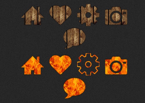
CSS3/SVG质感背景小图标 镂空效果图标按钮
在线演示 源码下载
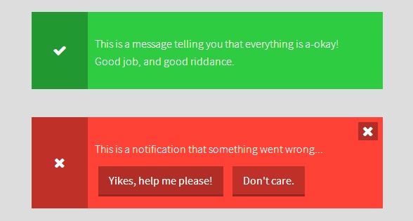
HTML5/CSS3弹出提示框 内置功能按钮
这款HTML5 教程非常实用,是一款带有动画特效的弹出提示框,样式也很不错。
核心jQuery代码:
- function closeMessage(el) {
- el.addClass('is-hidden');
- }
- $('.js-messageClose').on('click', function(e) {
- closeMessage($(this).closest('.Message'));
- });
- $('#js-helpMe').on('click', function(e) {
- alert('Help you we will, young padawan');
- closeMessage($(this).closest('.Message'));
- });
- $('#js-authMe').on('click', function(e) {
- alert('Okelidokeli, requesting data transfer.');
- closeMessage($(this).closest('.Message'));
- });
- $('#js-showMe').on('click', function(e) {
- alert("You're off to our help section. See you later!");
- closeMessage($(this).closest('.Message'));
- });
- $(document).ready(function() {
- setTimeout(function() {
- closeMessage($('#js-timer'));
- }, 5000);
- });
在线演示 源码下载
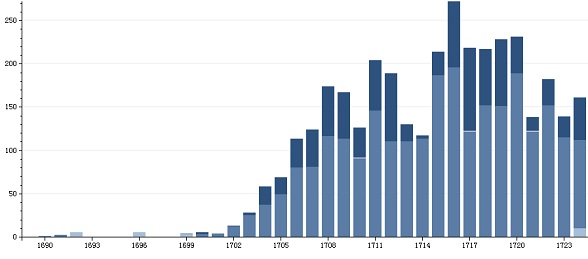
HTML5柱状图表 可合并多张图表的数据
又是一款HTML5图表应用,外观很普通,但是其合并功能十分强大。
在线演示 源码下载
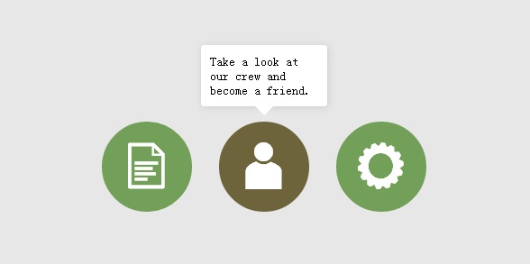
HTML5/CSS3提示框Tooltip动画
一款基于CSS3的Tooltip工具,带有淡入淡出动画。
核心CSS代码:
- .tooltip p { font-family: sans-serif;
- font-size:14px;
- font-weight:300;}
- .tooltip { width:120px;
- padding:10px;
- border-radius:3px;
- position:absolute;
- box-shadow:1px 1px 10px 0 #ccc;
- margin: -500px 0 0 -20px;
- background:#fff;
- -webkit-transition:margin .5s ease-in-out;
- -moz-transition:margin .5s ease-in-out;}
- .item:hover { background:#6d643b;}
- .item:hover .tooltip {
- margin:-145px 0 0 -20px;
- -webkit-transition: margin .15s ease-in-out;
- -moz-transition: margin .15s ease-in-out;}
- .arrow {
- position:absolute;
- margin:10px 0 0 50px;
- width: 0;
- height: 0;
- border-left: 10px solid transparent;
- border-right: 10px solid transparent;
- border-top: 10px solid #fff;
- }
HTML5/CSS3图片分割遮罩滑块动画
该应用可以将任意元素遮盖在图片上方,并且指定遮住的部分。
核心jQuery代码:
- (function($){
- $(function(){
- $('.code-wrapper').on( "mousemove", function(e) {
- var offsets = $(this).offset();
- var fullWidth = $(this).width();
- var mou** = e.pageX - offsets.left;
- if (mou** < 0) { mou** = 0; }
- else if (mou** > fullWidth) { mou** = fullWidth }
- $(this).parent().find('.divider-bar').css({
- left: mou**,
- transition: 'none'
- });
- $(this).find('.design-wrapper').css({
- transform: 'translateX(' + (mou**) + 'px)',
- transition: 'none'
- });
- $(this).find('.design-image').css({
- transform: 'translateX(' + (-1*mou**) + 'px)',
- transition: 'none'
- });
- });
- $('.divider-wrapper').on( "mouseleave", function() {
- $(this).parent().find('.divider-bar').css({
- left: '50%',
- transition: 'all .3s'
- });
- $(this).find('.design-wrapper').css({
- transform: 'translateX(50%)',
- transition: 'all .3s'
- });
- $(this).find('.design-image').css({
- transform: 'translateX(-50%)',
- transition: 'all .3s'
- });
- });
-
- }); // end of document ready
- })(jQuery);

在线演示 源码下载
【炫酷霸气的HTML5/jQuery应用及源码】相关文章
本文来源:https://www.51html5.com/a1321.html
﹝炫酷霸气的HTML5/jQuery应用及源码﹞相关内容
- 不容错过的jQuery图片动画及源码
- 10个web前端基于jQuery动画插件及源码
- HTML5/jQuery应用助网站走向高大上
- 关于HTML5的十条霸气侧漏预测
- Popline:帅气的浮动 HTML5 文本编辑器工具栏
- 7款炫酷实用 jQuery/HTML5图片应用
- jQuery炫酷点击变形全屏放大的模态窗口
- jQuery/CSS3 3D焦点图动画 多种炫酷图片切换特效
- jQuery炫酷图片3d背景视觉差特效
- 7款非常实用的jQuery/CSS3插件演示和源码