CSS Transition (CSS过渡效果)入门
尽管人们期待屏幕显示技术有所改进,但CSS和HTML却只提供了少数的交互设计控制,而且还只是双向状态的而非渐进状态,如:一个链接只能是一种颜色或另一种颜色,文本域只能是一种尺寸或另一种尺寸,一幅照片要么透明要么不透明。没有从两种状态的之间的部分,即没有过渡。
这种不优雅的切换效果使很多页面让人感觉突兀。虽然我们可以用DHTML和jQuery来实现过渡效果,但这需要很多代码来实现原本很简单的事情。
在这篇文章中,我们用一种简洁的方法来给页面增加过渡效果,你将会发现CSS ransitions的一些有用的信息以及如何使用它们。
几个月前,我曾冒失地建议设计师们应该使用CSS3新技术来实现他们期待很久的一些基本样式,但问题是这些技术在IE中(包括IE8)都无法实现。一些读者认为建议使用那四分之三的人无法看到的新技术是轻率的。
对于这些读者,我会说:先不要急于决定,因为我将会向你们介绍CSS中另一个属性,它可以用仅仅几行代码为任何元素添加过渡效果。
CSS3正在引入CSS transition技术,但已经作为一个扩展,CSS transition已被添加进了Webkit。这意味着这项技术目前只能在基于Webkit引擎的浏览器上使用,如Apple Safari和Google Chrome。
CSS过渡效果的由来
过渡作为Webkit的一部分已经有一段时间了,基于此,Safari UI实现了其他浏览器无法实现的很多酷炫的效果。但W3C CSS Workgroup拒绝将其加入官方标准,一些成员认为过渡效果并非样式属性,而且已经可以用脚本实现。
但很多设计者和开发者,包括我在内,认为过渡效果实际上是一种动态样式属性,而非传统上我们很多人使用的静态样式。
幸运的是,争论已经过去,去年三月份来自Apple和Mozilla的代表们开始将CSS Transition Module 加入CSS Level 3 specification,和Apple加入Webkit的那部分非常接近。
渐进增强设计的简介
在进行下面的内容之前,让我们先强调一点:如果样式在浏览器上不具有互操作性,永远不要把网站功能依赖于样式。
这就是说,你可以用样式如过渡效果和增强设计来改进用户体验,而不牺牲那些无法看到它们的用户的可用性。只要能让用户离开了那些过渡效果仍然可以完成他们的任务就好。
首先介绍一些过渡的概念
CSS过渡不会替代DHTML,但可以在支持过渡效果的浏览器中增强你的设计,并且不用担心破坏其他用户的浏览体验。
你需要在Apple Safari 3+或者Google Chrome中看到过渡效果,这两个浏览器都可以在Mac和PC上使用。
反转
过渡效果最明显的表现就是当用户把鼠标悬停在某个元素上时高亮它们,如链接、表格、表单域、按钮等。过渡可以给页面增加一种非常平滑的外观。
Example #1
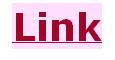
HTML
<div class="example">
 <p><a href="#">Link</a></p>
</div>
CSS
#example1 p { text-align: left; }
#example1 a:link {
 font-size: 3em;
 color: blue;
 background-color: rgb(255,255,255);
 -webkit-transition: color .5s linear, background-color .5s linear;
 transition: color .5s linear, background-color .5s linear;
}
#example1 a:hover {
 color: red;
 background-color: rgb(255,204,255);
 -webkit-transition: color .5s linear, background-color .5s linear;
 transition: color .5s linear, background-color .5s linear;
}
#example1 a:active {
 color: green;
 -webkit-transition: color .5s linear;
 transition: color .5s linear;
}
下拉菜单
CSS过渡使纯CSS来实现下拉菜单变得非常容易。
Example #2
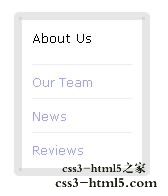
HTML
<div class="example">
 <ul class="menu">
  <li>About Us</li>
   <ul class="drop">
    <li><a href="#">Our Team</a></li>
    <li><a href="#">News</a></li>
    <li><a href="#">Reviews</a></li>
    <li><a href="#">Contact</a></li>
   </ul>
 </ul>
</div>
CSS
#example2 {
 height:200px;
}
#example2 a:link {
 color: blue;
 text-decoration: none;
 -webkit-transition: color .25s ease-in 0s;
 transition: color .25s ease-out 0s;
}

#example2 a:hover {
 color: red;
 -webkit-transition: color .25s ease-in .1s;
 transition: color .25s ease-out .1s;
}

#example2 a:active {
 color: green;
 transition: color .25s ease;
}

#example2 ul {
 list-style: none;
 margin: 0;
 padding: 0;
}

#example2 .menu {
 display: block; position: relative;
 top: .9em;
 left: 0;
 padding: 10px;
 height: auto;
 width: 100px;
 border: 8px solid rgba(204,204,204,.5);
 cursor: pointer;
 background-color: rgba(255,255,255,.75);
 -webkit-border-radius: 5px;
 -moz-border-radius: 5px;
 border-radius: 5px;
}

#example2 ul.menu  li {
 font-weight: normal;
 list-style: none;
}

#example2 ul.menu  li a:link {
 font-weight: normal;
 list-style: none;
 font-size: 12px;
 margin-left: 0;
 padding-left: 0;
}

#example2 ul.menu ul li {
 font-weight: normal;
 padding: 5px 0;
 margin:0;
 border-top: 1px solid rgb(204,204,204);
 background-color: rgb(255,255,255);
 -webkit-transition: background-color .5s ease;
 transition: background-color .2s ease;
}

#example2 .drop {
 display: block; position: relative;
 height: 0;
 overflow: hidden;
 width: 100px;
 opacity: 0;
 -webkit-transition: opacity .25s linear 0s, height .25s ease-out .1s;
 transition: opacity .25s linear 0s, height .25s ease-out .1s;
}

#example2 ul.menu ul li:hover {
 background-color: rgb(234,234,234);
 -webkit-transition: background-color .5s ease;
 transition: background-color .2s ease;
}

#example2 ul.menu:hover>.drop {
 height: 140px;
 opacity: 1;
 -webkit-transition: opacity .25s linear 0s,  height .25s linear 0s;
 transition: opacity .25s linear 0s,  height .25s linear 0s;
}
动画
你可以使用CSS过渡来让一个对象在两点之间移动。
HTML
<div class="example">
 <div class="move">
  <p><strong>Example #3</strong></p>
  <p class="control" style="color:#FFFFFF;">Click & Hold!</p>
  <div id="astro"><img src="http://netdna.webdesignerdepot.com/uploads/css101/astro-127531.png"></div>
 </div>
</div>
CSS
#example3 {
 background-color: black;
 color: white;
}

#example3 .control {
 text-align: center; font-size: 3em;
}

#example3 .move { cursor: pointer;}

#example3 .move>#astro {
 position: relative;
 top: 0;
 left: 250px;
 -webkit-transition: top 2s ease-in-out, left 2s ease;
 transition: top 2s  ease-in-out, left 2s ease;
}

#example3 .move:active>#astro {
 top: 10px;
 left: 10px;
 -webkit-transition: top 2s ease-in-out, left 2s ease;
 transition: top 2s  ease-in-out, left 2s ease;
}
过渡,状态和动作
我们在此稍作停留,在深入了解过渡之前,我们必须理解一个元素产生过渡效果的各种状态。
状态定义了一个特定元素在当前如何与用户进行交互,它们在CSS中用伪类来标注。例如:当用户把鼠标悬停在某一元素上时,那个元素将应用用伪类hover的样式。
| 动态伪类
【CSS Transition (CSS过渡效果)入门】相关文章 2. CSS3 Transitions, Transforms和Animation使用简介与应用展 5. Telefónica与Mozilla开拓基于HTML5互联网设备 10. CSS3 transition实现超酷图片墙动画效果 本文来源:https://www.51html5.com/a839.html ﹝CSS Transition (CSS过渡效果)入门﹞相关内容
「CSS Transition (CSS过渡效果)入门」相关专题其它栏目也许您还喜欢 |