jQuery+CSS3动画的水平组合布局
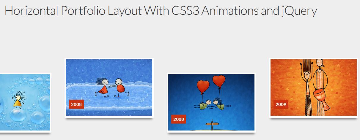
今天在本教程中,我们要创建水平的组合布局网站酷悬停效果。使用CSS3动画和过渡效果,以及一些jQuery来复制图像平移效果上悬停闪存悬停效果。
The Markup
<ul class="portfolio-items"> <li class="item"> <figure> <div class="view"> <img src="images/1.jpg"> </div> <figcaption> <p><span><a href="http://www.vladstudio.com/wallpaper/?thetwoandthebubbles">The Two and The Bubbles</a></span></p> <p><span>By Vlad Gerasimov</span></p> </figcaption> </figure> <div class="date">2005</div> </li> <li> <!-- second item --> </li> <li> <!-- third item --> </li> <!-- and so forth --></ul>
The CSS
.portfolio-items { height: 400px; overflow-x: scroll; overflow-y: hidden; white-space: nowrap; margin-bottom: 30px; position: relative;}.portfolio-items > li { display: inline-block; /*aligning items by top baseline makes sure the baseline doesn't change once the hover effect is fired and therefore the other items stay put*/ vertical-align: top;}.item { width: 300px; height: 202px; margin: 150px 20px 0; padding: 5px; border-radius:2px; box-shadow: 0px 10px 10px -5px rgba(0,0,0,0.5); background-color: white; font-size: 14px; /*initially all items are moved 300px up and faded out and rotated, they will fade into view and back to position later via javascript*/ opacity: 0; position: relative; top: -300px; transform: rotate(-135deg); transition: all .3s ease, opacity 2s ease, top 1s ease;}/*even items will be 100px lower than their siblings*/.item:nth-child(even) { margin-top: 100px;}
【jQuery+CSS3动画的水平组合布局】相关文章
4. phonegap教程第8讲 Jquery Mobile中流式布局,网格布局以及响应式布局教程 ...
本文来源:https://www.51html5.com/a978.html
上一篇:CSS伪类的动画和过渡效果应用
下一篇:jQuery+CSS3动画框架magic