CSS3 过渡特性创建信封效果的联系表单
最近给大家分享 CSS3 效果比较多,都是充分运用了 CSS3 来实现的。通过 CSS3 的新特性,我们创作出好的交互和效果的可能性大大增加。这篇文章中,我想与大家分享使用 CSS3 过渡特性实现的信封效果的联系表单。
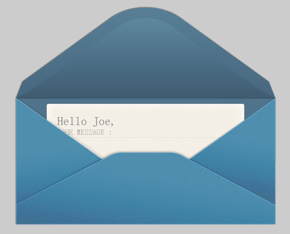
效果演示 插件下载
CSS3 代码:
- #form_wrap { overflow:hidden; height:446px; position:relative; top:0px;
- -webkit-transition: all 1s ease-in-out .3s;
- -moz-transition: all 1s ease-in-out .3s;
- -o-transition: all 1s ease-in-out .3s;
- transition: all 1s ease-in-out .3s;}
-
- #form_wrap:before {content:"";
- position:absolute;
- bottom:128px;left:0px;
- background:url('images/before.png');
- width:530px;height: 316px;}
-
- #form_wrap:after {content:"";position:absolute;
- bottom:0px;left:0;
- background:url('images/after.png');
- width:530px;height: 260px; }
-
- #form_wrap.hide:after, #form_wrap.hide:before {display:none; }
- #form_wrap:hover {height:776px;top:-200px;}
-
-
- form {background:#f7f2ec url('images/letter_bg.png');
- position:relative;top:200px;overflow:hidden;
- height:200px;width:400px;margin:0px auto;padding:20px;
- border: 1px solid #fff;
- border-radius: 3px;
- -moz-border-radius: 3px; -webkit-border-radius: 3px;
- box-shadow: 0px 0px 3px #9d9d9d, inset 0px 0px 27px #fff;
- -moz-box-shadow: 0px 0px 3px #9d9d9d, inset 0px 0px 14px #fff;
- -webkit-box-shadow: 0px 0px 3px #9d9d9d, inset 0px 0px 27px #fff;
- -webkit-transition: all 1s ease-in-out .3s;
- -moz-transition: all 1s ease-in-out .3s;
- -o-transition: all 1s ease-in-out .3s;
- transition: all 1s ease-in-out .3s;}
-
-
- #form_wrap:hover form {height:530px;}
-
- label {
- margin: 11px 20px 0 0;
- font-size: 16px; color: #b3aba1;
- text-transform: uppercase;
- text-shadow: 0px 1px 0px #fff;
- }
-
- input[type=text], textarea {
- font: 14px normal normal uppercase helvetica, arial, serif;
- color: #7c7873;background:none;
- width: 380px; height: 36px; padding: 0px 10px; margin: 0 0 10px 0;
- border:1px solid #f8f5f1;
- -moz-border-radius: 5px; -webkit-border-radius: 5px; border-radius: 5px;
- -moz-box-shadow: inset 0px 0px 1px #726959;
- -webkit-box-shadow: inset 0px 0px 1px #b3a895;
- box-shadow: inset 0px 0px 1px #b3a895;
- }
-
- textarea { height: 80px; padding-top:14px;}
-
- textarea:focus, input[type=text]:focus {background:rgba(255,255,255,.35);}
-
- #form_wrap input[type=submit] {
- position:relative;font-family: 'YanoneKaffeesatzRegular';
- font-size:24px; color: #7c7873;text-shadow:0 1px 0 #fff;
- width:100%; text-align:center;opacity:0;
- background:none;
- cursor: pointer;
- -moz-border-radius: 3px; -webkit-border-radius: 3px; border-radius: 3px;
- -webkit-transition: opacity .6s ease-in-out 0s;
- -moz-transition: opacity .6s ease-in-out 0s;
- -o-transition: opacity .6s ease-in-out 0s;
- transition: opacity .6s ease-in-out 0s;
- }
-
- #form_wrap:hover input[type=submit] {z-index:1;opacity:1;
- -webkit-transition: opacity .5s ease-in-out 1.3s;
- -moz-transition: opacity .5s ease-in-out 1.3s;
- -o-transition: opacity .5s ease-in-out 1.3s;
- transition: opacity .5s ease-in-out 1.3s;}
-
- #form_wrap:hover input:hover[type=submit] {color:#435c70;}
【CSS3 过渡特性创建信封效果的联系表单】相关文章
9. 联系方式
10. 全球颠覆性创新公司一览【信息图】
本文来源:https://www.51html5.com/a1053.html
﹝CSS3 过渡特性创建信封效果的联系表单﹞相关内容
- Jquery+CSS3实现一款简洁大气带滑动效果的弹出层
- Jquery+CSS3实现一款简洁大气带滑动效果的弹出层
- jQuery/CSS3实现拼图效果的相册插件
- CSS伪类的动画和过渡效果应用
- 超平滑的 CSS 过渡和变换动画效果插件
- jQuery+CSS3过渡的图像滑块Flux Slider
- jQuery带Tooltip表单验证的注册表单
- 使用jQuery和CSS3创建一个全屏幕幻灯效果
- Magic CSS3 – 创建各种神奇的交互动画效果
- 使用jQuery和CSS3创建一个全屏幕幻灯效果